
How to Choose Colors That Transform
Introduction
Color is more than just a visual element in art — it’s a powerful communicator that affects our emotions, perceptions, and even our physical responses. When selecting digital art for your home or office, understanding color psychology can help you create spaces that not only look beautiful but also feel exactly the way you want them to. As someone who transitioned from corporate presentations (where color psychology was crucial for effective communication) to creating digital art, I’ve seen firsthand how the right color choices can transform both a space and the people in it.
In this comprehensive guide, I’ll explore the fascinating psychology of color in digital art and provide practical advice for selecting pieces that create your desired atmosphere.
The Science Behind Color Psychology
Before diving into specific colors and their effects, let’s understand the science:
How We Process Color
Our perception of color is both physiological and psychological:
- Light enters our eyes and stimulates color receptors (cones)
- Our brain processes these signals and interprets them as color
- This interpretation is influenced by personal experiences, cultural background, and even evolutionary factors
- Different colors trigger different neurological responses, affecting mood and behavior.
Universal vs. Personal Color Responses
Color psychology operates on two levels:
- Universal responses: Some color reactions appear consistent across cultures and individuals (like blue creating calm)
- Personal associations: Individual experiences create unique color associations (like a color reminding you of childhood)
- Cultural influences: Different cultures assign different meanings to colors (white symbolizes purity in Western cultures but mourning in some Eastern traditions)
Understanding both universal and personal responses helps you select digital art that resonates on multiple levels.
The Emotional Impact of Primary Colors
Let’s explore how the primary colors affect our emotions and spaces:
Red: Energy and Passion
Red is a powerful, attention-demanding color:
- Psychological effects: Increases heart rate, stimulates appetite, creates feelings of urgency and excitement
- Best spaces for red art: Dining rooms, kitchens, exercise spaces, or any room needing energy
- Considerations: Use red art as an accent rather than a dominant element in rooms where relaxation is important
- Digital art applications: Red works well as an accent color in abstract pieces or as the focal point in floral or dramatic landscape prints
Blue: Calm and Tranquility
- Psychological effects: Lowers blood pressure, reduces anxiety, promotes thoughtful communication
- Best spaces for blue art: Bedrooms, bathrooms, offices, meditation spaces
- Considerations: Very cool blues can sometimes feel chilly in spaces lacking natural warmth
- Digital art applications: Blue-dominant landscapes, seascapes, abstract pieces work beautifully in spaces designed for relaxation or focus
Yellow: Optimism and Clarity
- Psychological effects: Stimulates mental activity, promotes optimism, enhances concentration
- Best spaces for yellow art: Home offices, kitchens, creative spaces, dark rooms needing brightness
- Considerations: Too much bright yellow can create visual fatigue; softer yellows are more versatile
- Digital art applications: Yellow accents bring life to neutral art; yellow-dominant pieces create focal points that energize spaces
The Subtle Influence of Secondary Colors
Secondary colors offer more nuanced emotional effects:
Green: Balance and Renewal
Green bridges the calming qualities of blue with the energy of yellow:
- Psychological effects: Reduces stress, promotes balance, creates feelings of renewal
- Best spaces for green art: Any room where balance is desired — living rooms, transitional spaces, home offices
- Considerations: Different greens create different effects (forest greens ground, while spring greens energize)
- Digital art applications: Botanical prints, landscapes, abstract pieces with green elements bring the restorative qualities of nature indoors
Purple: Creativity and Luxury
Purple combines the energy of red with the calm of blue:
- Psychological effects: Stimulates creativity and imagination, creates feelings of luxury and spirituality
- Best spaces for purple art: Creative studios, meditation spaces, reading nooks, master bedrooms
- Considerations: Deep purples add sophistication; lighter lavenders create a more peaceful effect
- Digital art applications: Abstract purple-toned art adds creative energy; lavender landscapes create serene, dreamy atmospheres
Orange: Enthusiasm and Warmth
Orange blends the passion of red with the optimism of yellow:
- Psychological effects: Stimulates enthusiasm, creates feelings of warmth and welcome
- Best spaces for orange art: Social spaces, exercise rooms, creative areas
- Considerations: A little orange goes a long way; consider terracotta or peach tones for subtlety
- Digital art applications: Orange accents add warmth to cool-toned art; sunset imagery with orange tones creates inviting atmospheres
The Sophistication of Neutral Colors
Neutrals are far from boring — they’re sophisticated color choices with powerful effects:
Black: Sophistication and Drama
Black creates powerful statements in digital art:
- Psychological effects: Creates feelings of sophistication, mystery, and drama
- Best spaces for black-dominant art: Dining rooms, powder rooms, offices, or as anchors in minimalist spaces
- Considerations: Balance with lighter elements to prevent heaviness
- Digital art applications: Black and white photography, high-contrast abstract pieces, silhouette art
White: Purity and Possibility
White space in art is as important as colored elements:
- Psychological effects: Creates feelings of purity, possibility, and openness
- Best spaces for white-dominant art: Already colorful rooms, small spaces that benefit from visual expansion
- Considerations: Pure white can feel clinical; consider off-whites for warmth
- Digital art applications: Minimalist art, winter scenes, negative space compositions
Grey: Sophistication and Balance
Grey is the ultimate neutral bridge:
- Psychological effects: Creates feelings of sophistication and calm without the intensity of black
- Best spaces for grey-dominant art: Transitional spaces, rooms with bold accent colors
- Considerations: Warm greys (with brown undertones) versus cool greys (with blue undertones) create different effects
- Digital art applications: Urban landscapes, misty scenes, sophisticated abstracts
Color Harmony in Digital Art Selection
Beyond individual colors, consider how colors work together:
Complementary Color Schemes
Opposite colors on the color wheel create vibrant energy:
- Blue and orange, purple and yellow, red and green
- Creates dynamic tension and visual interest
- Works well in spaces where energy and engagement are desired
- Consider art with complementary color schemes for rooms that need visual stimulation
Analogous Color Schemes
Colors adjacent on the color wheel create harmony:
- Blue-green-teal or red-orange-yellow combinations
- Creates a cohesive, harmonious feeling
- Works well in spaces designed for relaxation or focus
- Look for digital art with analogous color schemes for peaceful, unified spaces
Monochromatic Color Schemes
Variations of a single color create sophisticated depth:
- Different shades, tints, and tones of one color
- Creates a cohesive, elegant feeling
- Works well in minimalist or sophisticated spaces
- Consider monochromatic digital art for spaces where color cohesion is important
Practical Applications: Selecting Digital Art for Specific Rooms
Let’s apply color psychology to specific spaces:
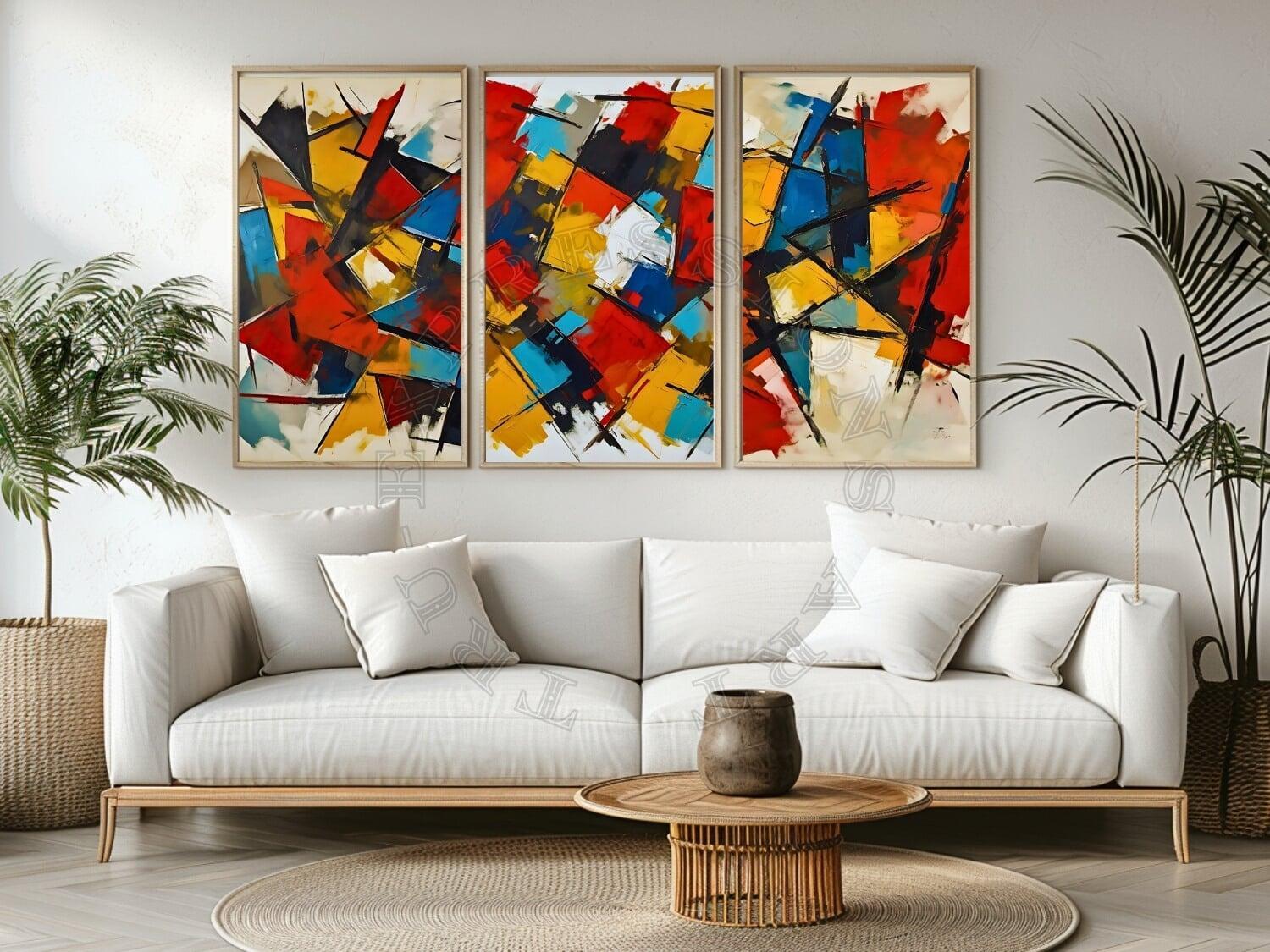
Living Room Art Selection
The living room typically serves multiple functions:
- For energetic, social living rooms: Consider art with warm colors (reds, oranges, yellows) to stimulate conversation
- For relaxing, peaceful living rooms: Choose art with cool colors (blues, greens, purples) to promote unwinding
- For versatile living rooms: Select art with a balanced color palette that includes both warm and cool tones
- Consider: The time of day you most use the room (evening spaces might benefit from warmer tones)
Bedroom Art Selection
Bedrooms benefit from colors that promote relaxation:
- Primary bedrooms: Blues, lavenders, and soft greens promote rest; consider the mood you want to create
- Children’s bedrooms: Softer versions of bright colors stimulate creativity without over excitement
- Guest bedrooms: Neutral art with subtle color accents creates welcoming, versatile spaces
- Consider: Your personal color associations with restfulness and comfort
Home Office Art Selection
Productivity spaces need thoughtful color selection:
- For focus and concentration: Blues and greens promote sustained attention
- For creativity and brainstorming: Purples and yellows stimulate innovative thinking
- For balanced productivity: Consider art with both cool and warm elements
- Consider: The type of work you do and what mental state enhances your performance
Creating Color Cohesion Throughout Your Space
Digital art can help create color flow between rooms:
Connecting Spaces with Color Threads
Use art to create visual connections:
- Select digital prints that contain colors from adjacent rooms
- Use art in transitional spaces (hallways, landings) that bridges the color schemes of connected rooms
- Consider a “color story” that evolves as you move through your home
Balancing Bold and Subtle Color Statements
Create rhythm with varying color intensity:
- Use bold, colorful art as focal points in main spaces
- Balance with more subtle, color-restrained pieces in secondary areas
- Consider the cumulative effect of all art pieces viewed together
Seasonal Color Adjustments
Digital art prints allow for seasonal refreshes:
- Winter: Consider art with warmer tones to counterbalance cold weather
- Summer: Cooler-toned art can create a psychologically cooling effect
- Transitional seasons: Art that combines warm and cool elements bridges seasonal shifts
Conclusion: Trusting Your Personal Color Response
While color psychology provides valuable guidelines, your personal response to colors should guide your final selections:
- Notice your reactions: Pay attention to how different colors in art make you feel
- Consider your color history: Reflect on colors that have positive associations in your life
- Trust your intuition: The right art will resonate on both an aesthetic and emotional level
- Experiment: Digital art prints offer the flexibility to try different options
By understanding both the universal psychology of color and your personal color preferences, you can select digital art that not only beautifies your space but also creates the exact emotional atmosphere you desire. Remember that the best art doesn’t just match your sofa — it transforms how you feel in your space.
About the Author:
Ray Erens is a retired executive who now creates digital art that combines travel photography, landscapes, and AI enhancement. His work focuses on creating prints that add meaning and beauty to everyday spaces. Visit Tru-Expressions Art on Etsy to explore his collection of printable wall art.
Want to learn more about transforming your space with digital art?
Download our FREE Home Styling Guide for expert tips and inspiration.